LMS Library Redesign
Problem to solve: Inkling users were having trouble with the Inkling Library. It was too big, with no way to find what you’re looking for fast. Sorting and filtering options didn’t stay, and there was no organization.
Solution: An updated interface, with the categories users needed the most at the top and quick ways to find Recently Viewed and Favorites.
Old Library Page
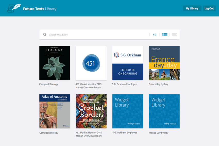
Users were reporting this page could get unwieldy (very long) and there were no ways to quickly organize. The filter options were lackluster, and they didn’t stick after a user made a choice.
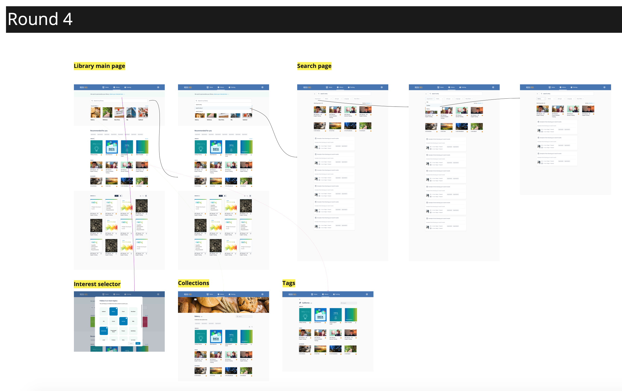
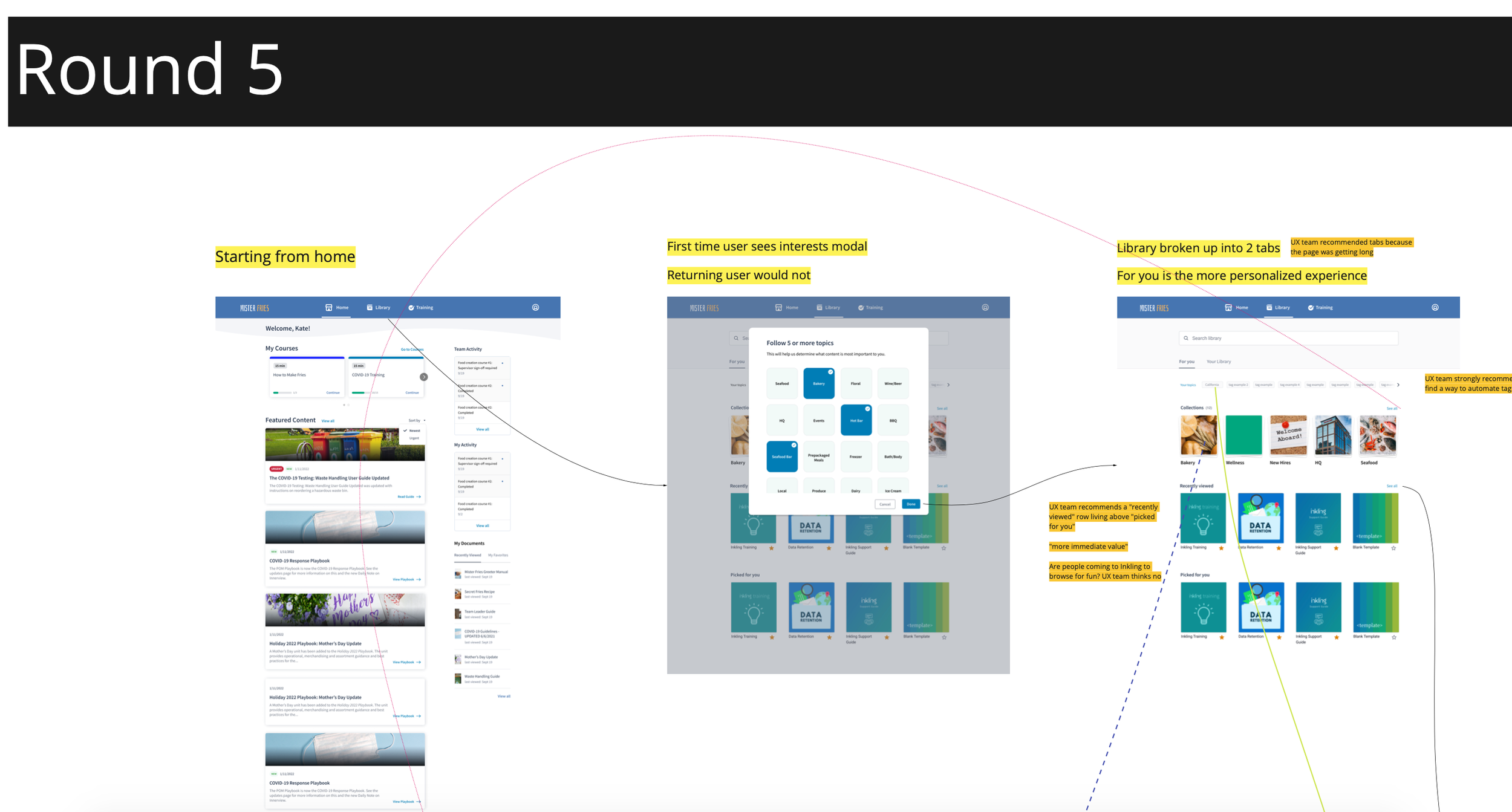
Process
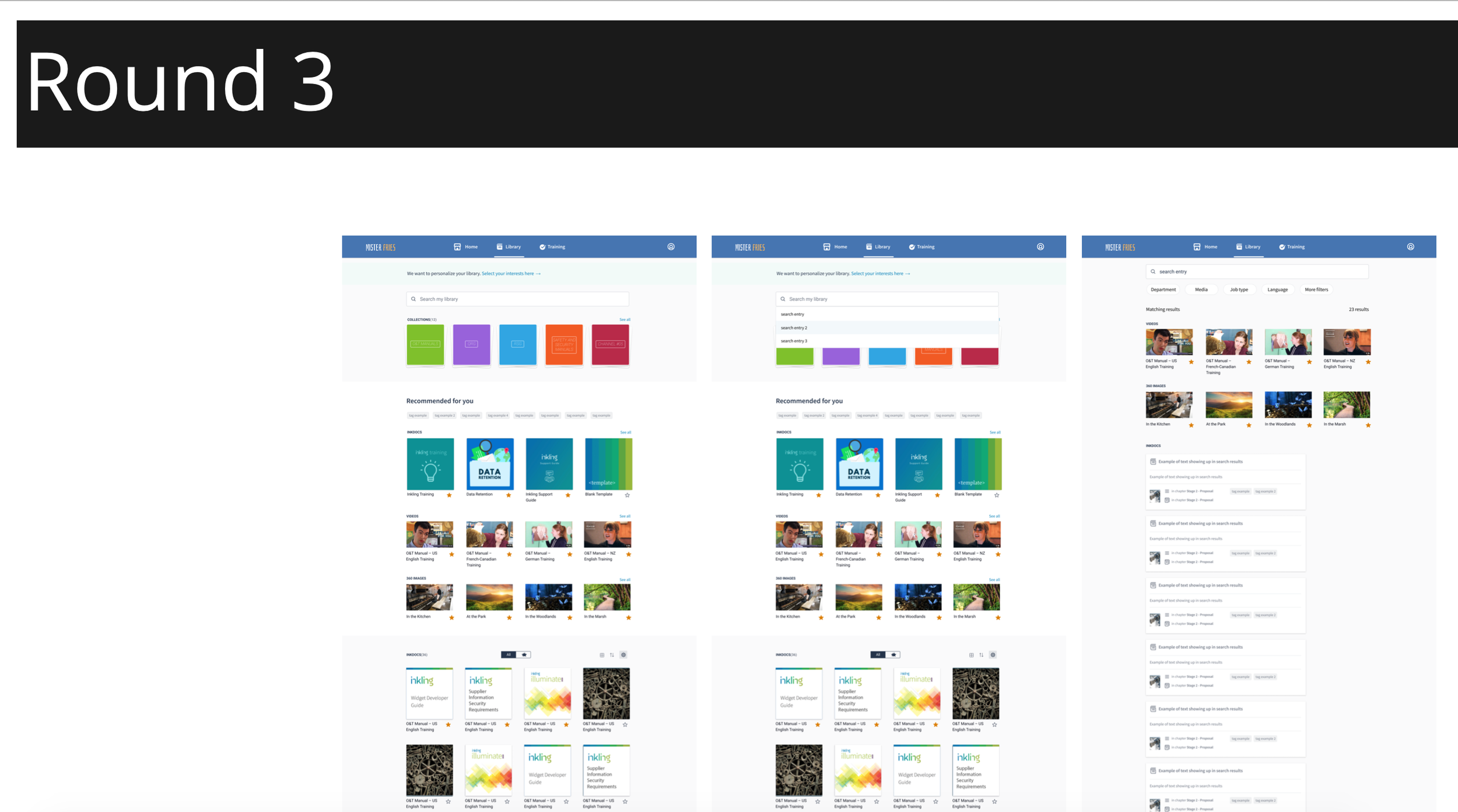
My team interviewed 20 of our B2B customers to uncover pain points about the above design. After performing heuristic analyses and iterating on new designs countless times, each time testing with customers in between, we settled on the design below.
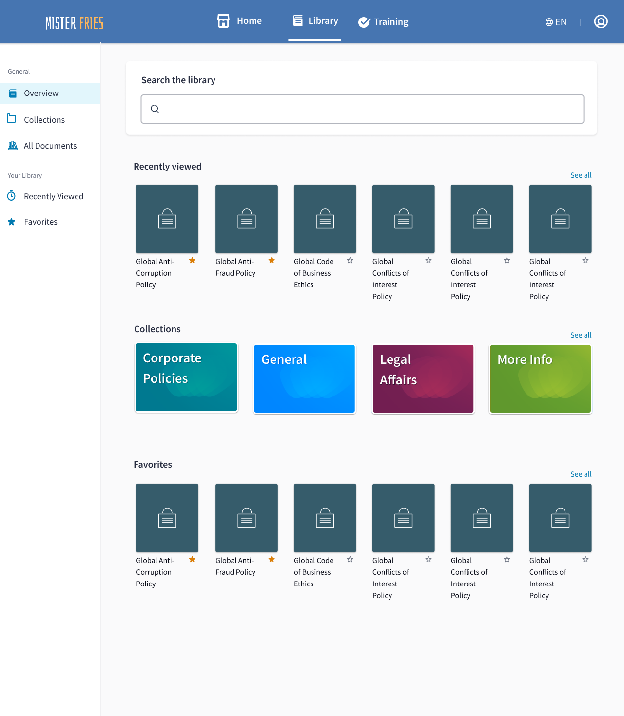
Desktop view
We started by creating an Overview page that allowed user’s Recently Viewed items, Collections, and Favorites to stand out. Through testing, we discovered a large majority of our customers used the same documents over and over, prompting us to add the Recently Viewed as the very top list item.
A left hand navigation proved via testing to be the quickest way for users to navigate around the page.
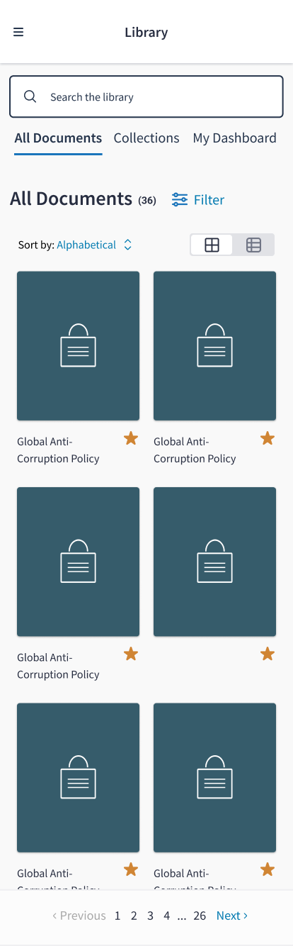
Mobile Web View
An issue with the previous design is that the page was not responsive and users had a hard time getting around the page. For our mobile web browser, we 1. made sure it was responsive, and 2. it flowed well.
Research + Process
Now that you’ve seen the designs, let’s go over the process and the research. Big thanks to Inkling’s User Researcher, Kathryn, who is brilliant, for coming up with the process and organization for this research project.
Below are screenshots from this project’s Miro board. Its difficult to convey the size of it - but it was a huge board. We used the RITE method for this round of research, ultimately testing designs with 21 customers.


Results
Testing showed that our new design got users to their desired locations 63% faster than the old page, and users gave it a preference score of 6/7, whereas the old site got a 2/7.