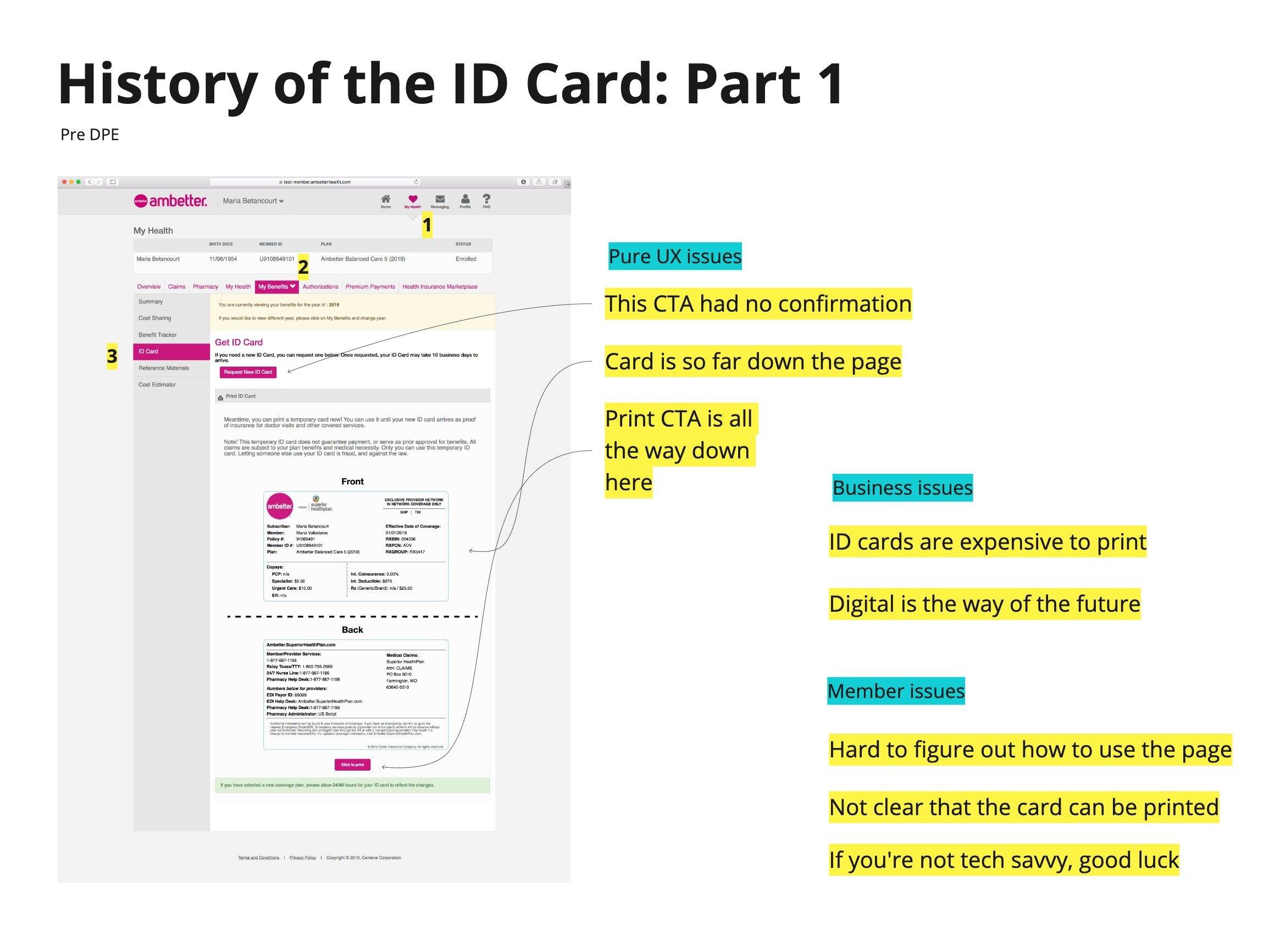
ID card experience redesign
One of the very first projects my team worked on when we were acquired was to redesign our members’ digital ID card experience. We had big dreams for the project:
We wanted to allow primary members to be able to access their dependent’s ID card (like a mom or a dad accessing their child’s card, for instance)
We wanted to allow members to add their cards to their mobile wallets
We wanted to let members save their cards to their phone’s camera roll
We wanted to give members confirmation that they ordered a new card by mail
We wanted the page to be responsive
We achieved all of these things (all these things didn’t exist on the original page), and more. One thing our team didn’t have, however, was a full engineering team, and a fully fleshed out design system. We created the original page in a super simple way that would be easy to go back and enhance the design when the design system was in place.
So, that brings us to where I came in.
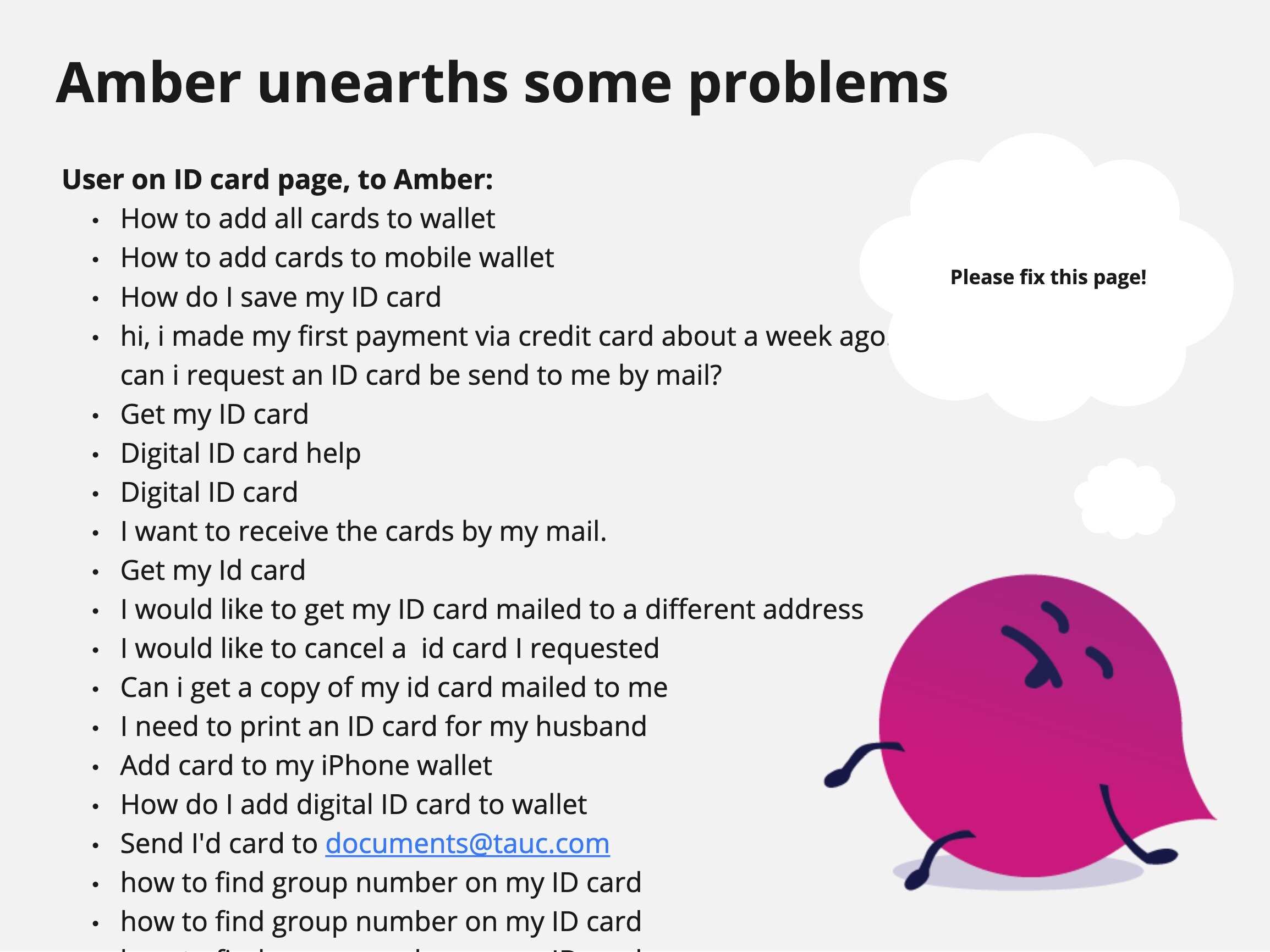
Take a look at the slideshow below to see the history and the design process of the ID card page.
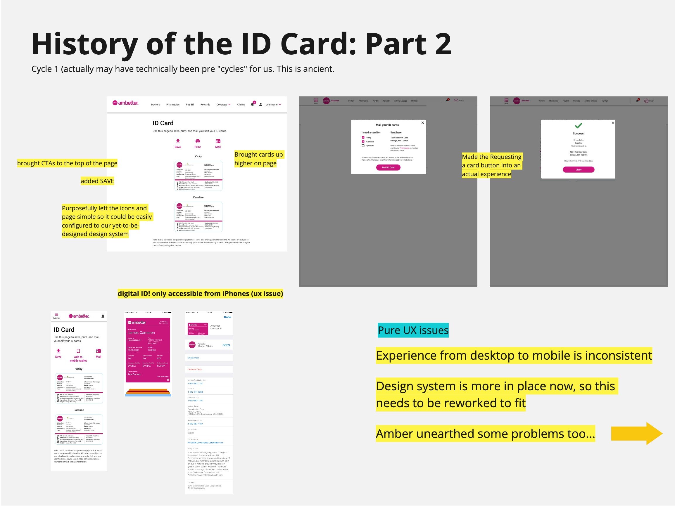
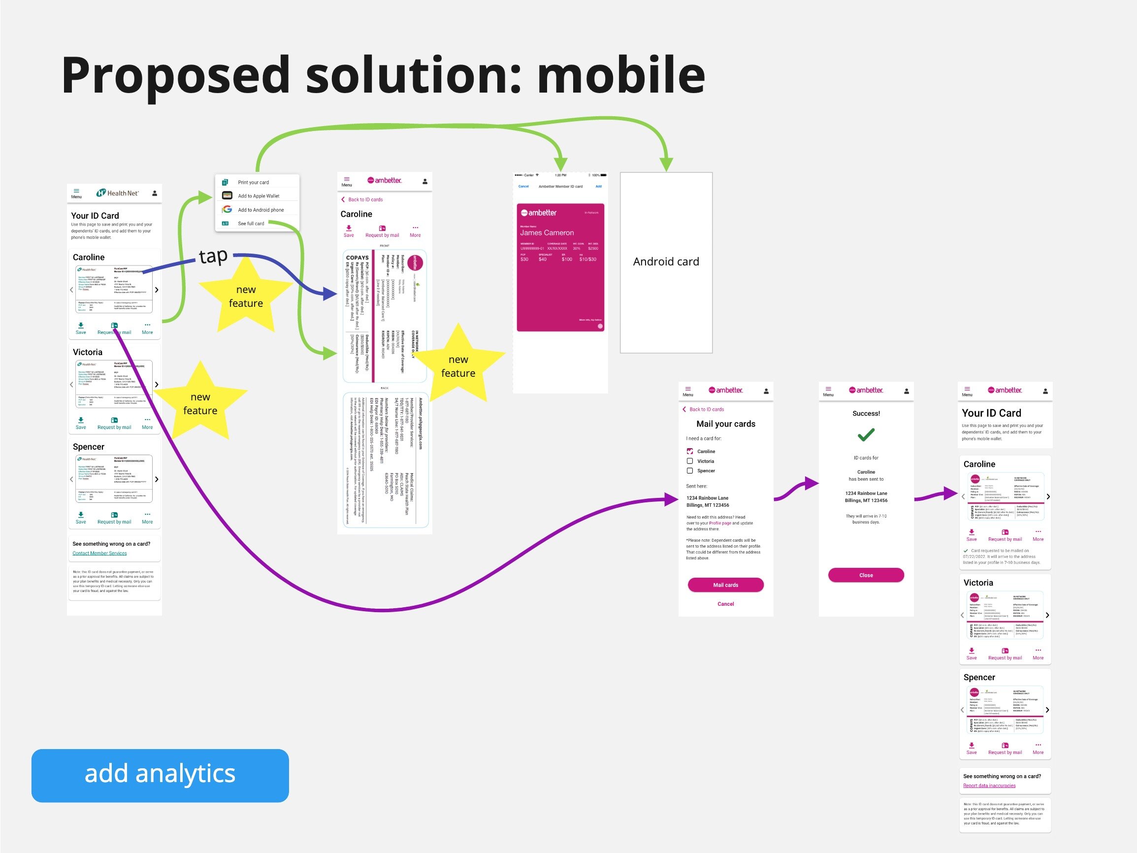
Here’s where the mobile designs landed. Note the colors and logo changed to reflect a different brand within the company. (Check out the desktop designs to see the full page’a functionality)


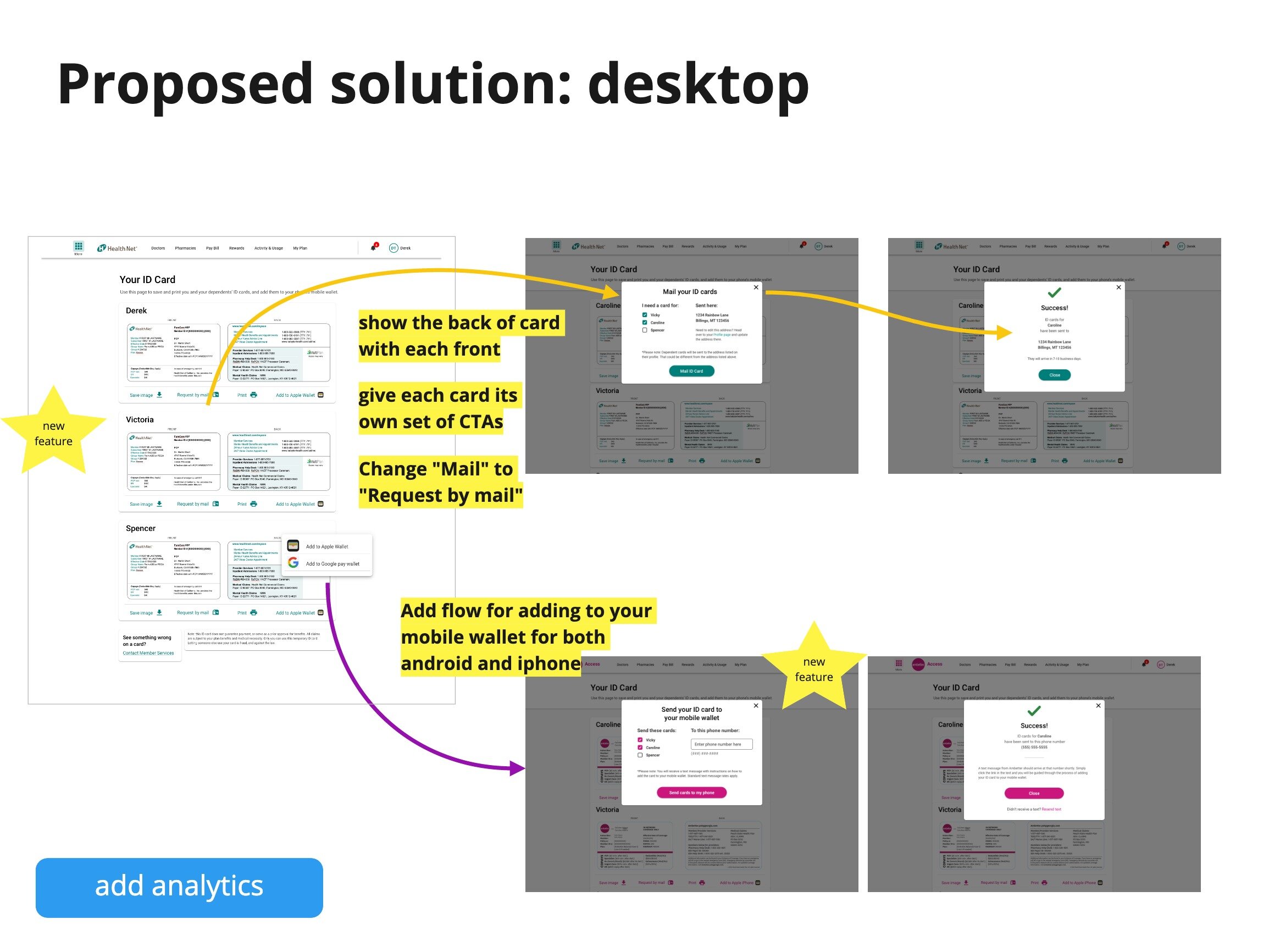
And here’s desktop:


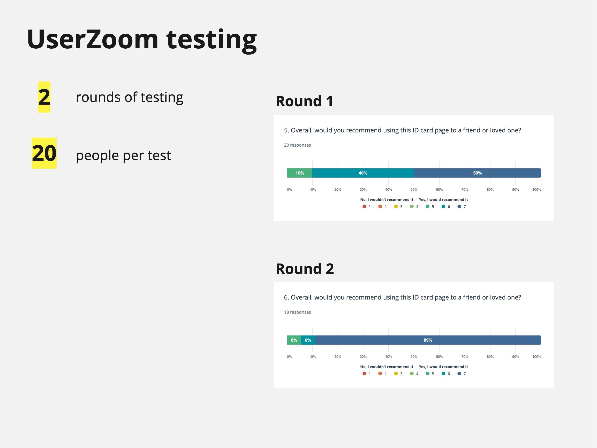
Ultimately, we succeeded at taking the ID card page into the 21st century, and we have the data to back this up.