Doctor directory redesign
This project started in March 2020 with a spur of the moment ask: could a product manager, a developer, and me come up with a brand new design for our company’s provider directory within three weeks?
The three of us laughed and then suddenly stopped laughing; we had to get to work!
Some backstory: our company’s find a provider directory hadn’t been updated in maybe 10 years. In order for a member to find a doctor, they had to go through a long, hand-held journey that involved more than 40 clicks to actually see any doctor data.
We decided our goal was to get user’s to doctor information in as few clicks as possible; in fact, we aimed for 0 clicks. And thus, our project began.
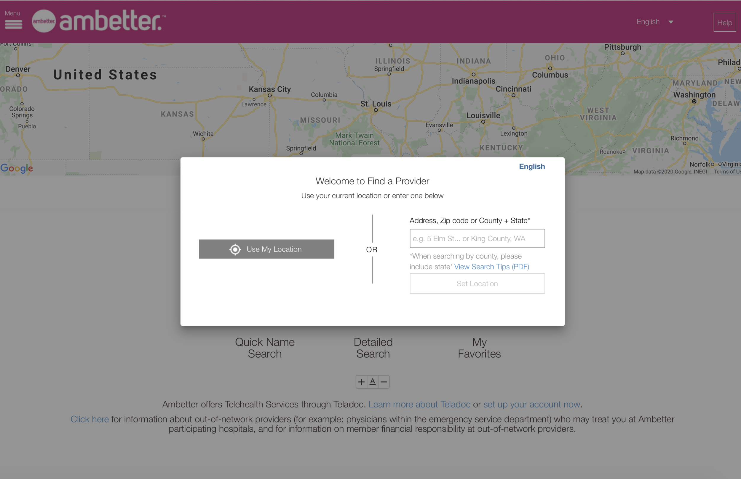
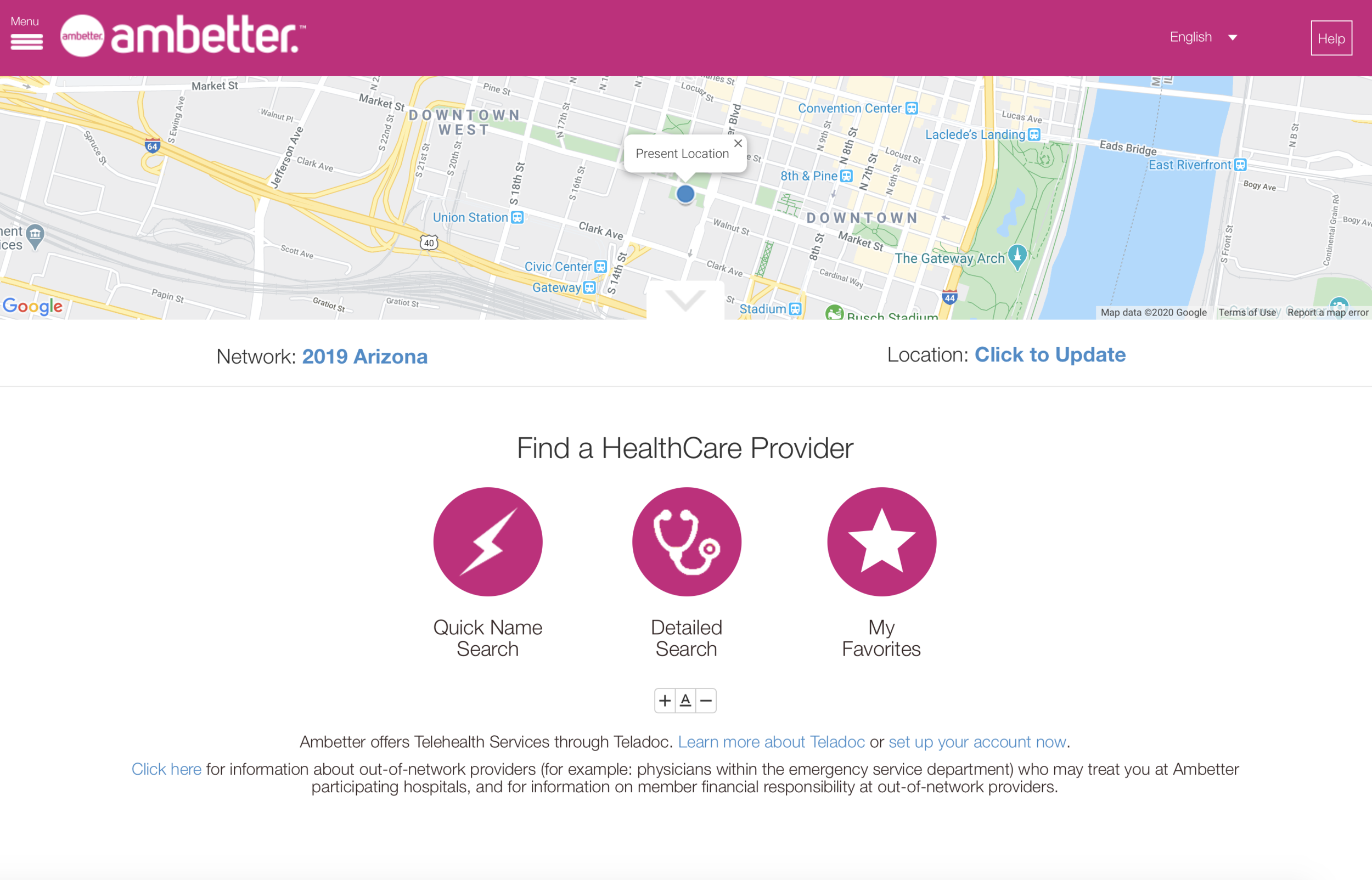
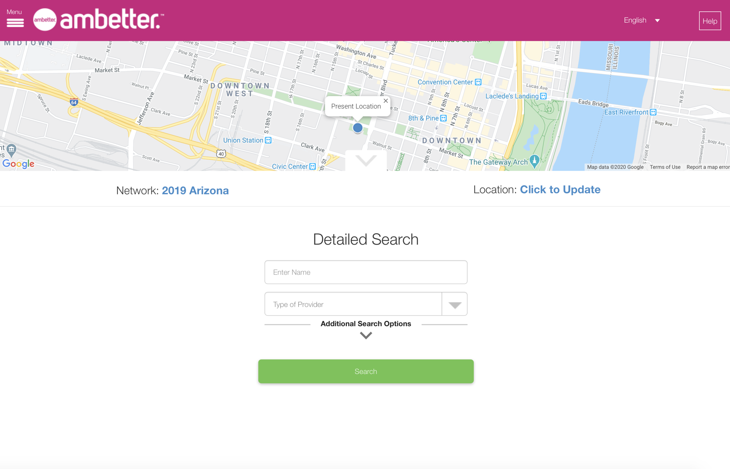

The slideshow above shows the original member journey, before our team took over. You can see it takes users a long time to get to any doctor data at all.
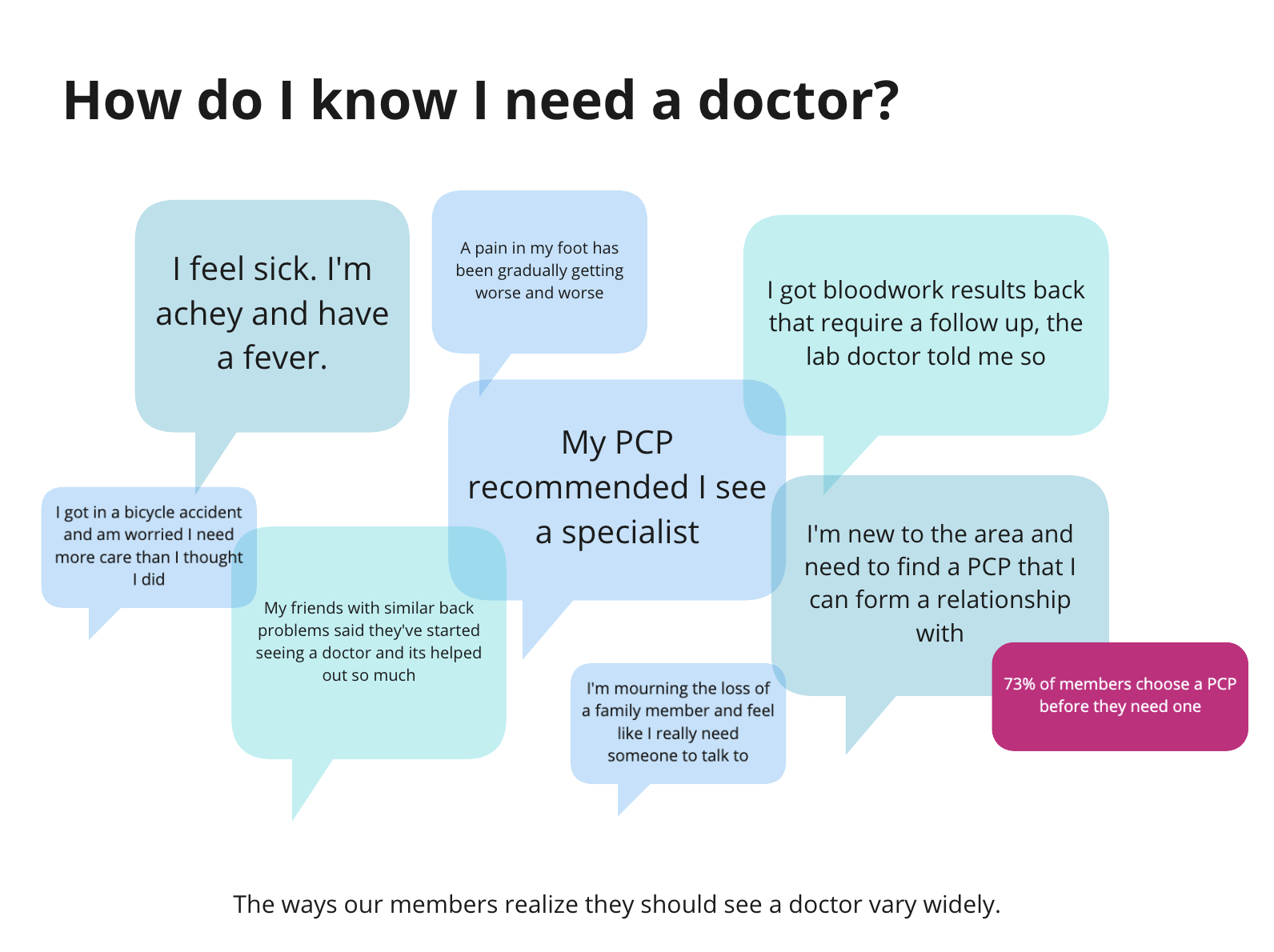
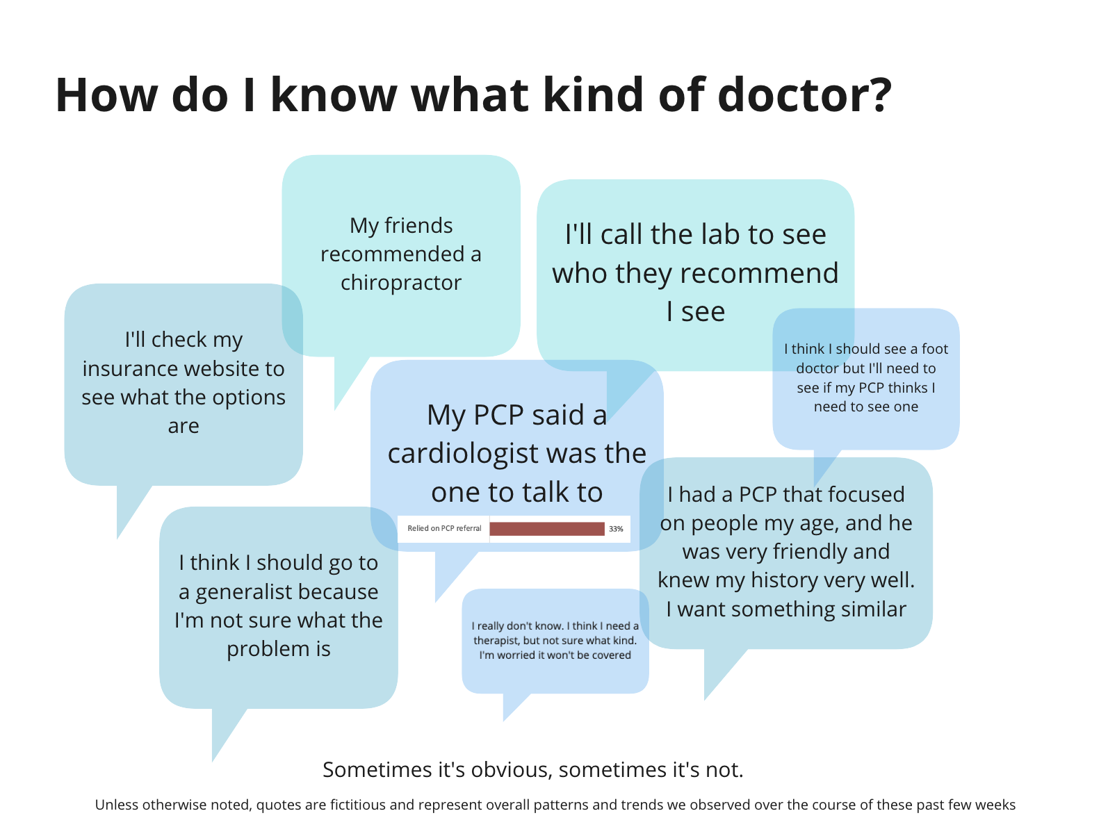
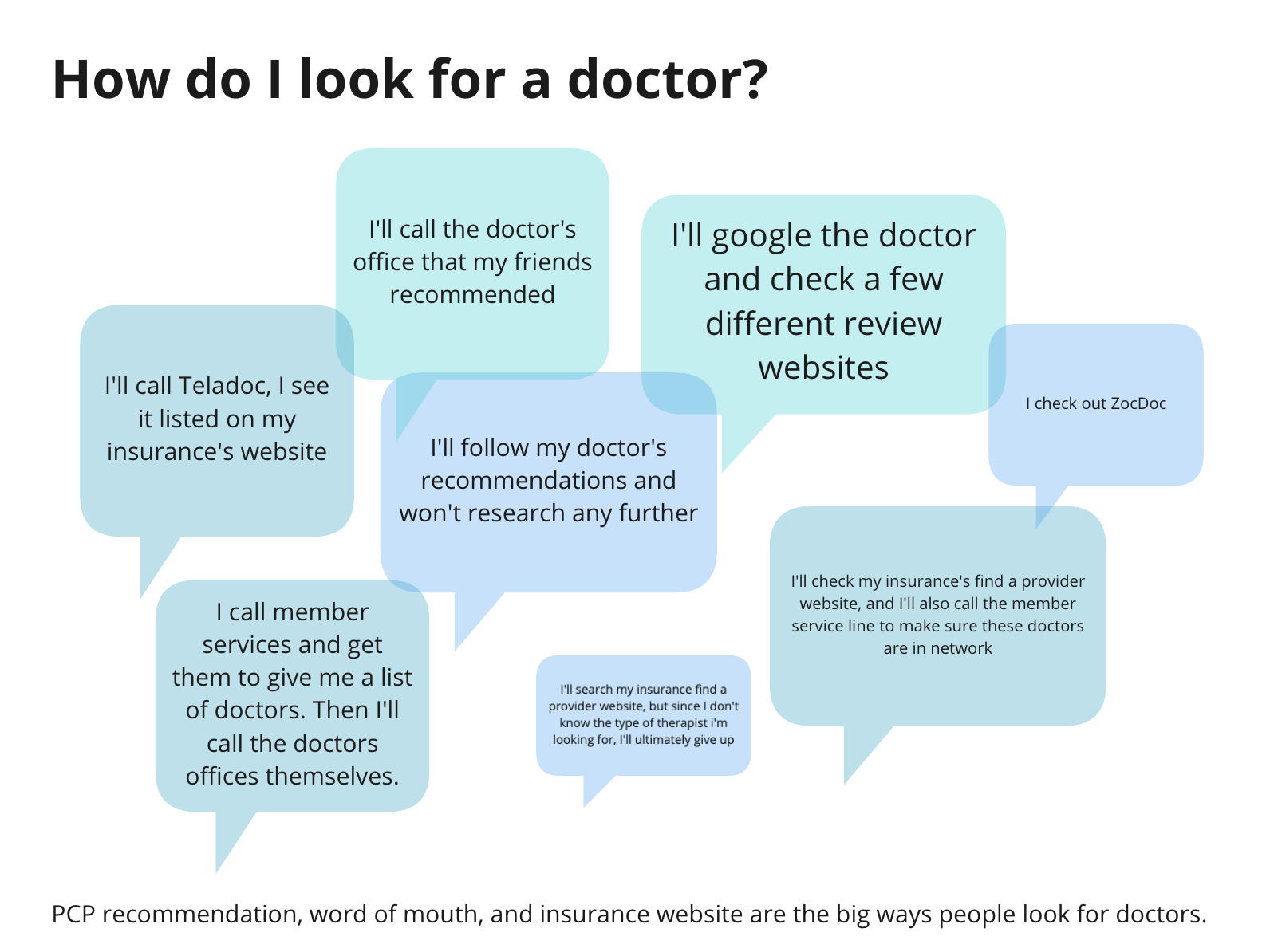
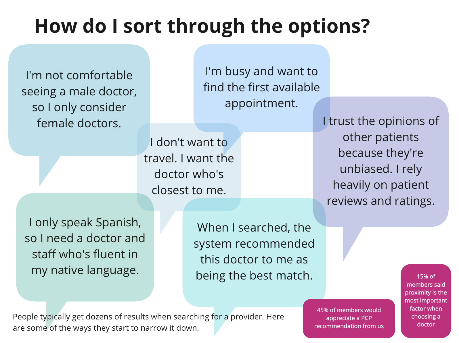
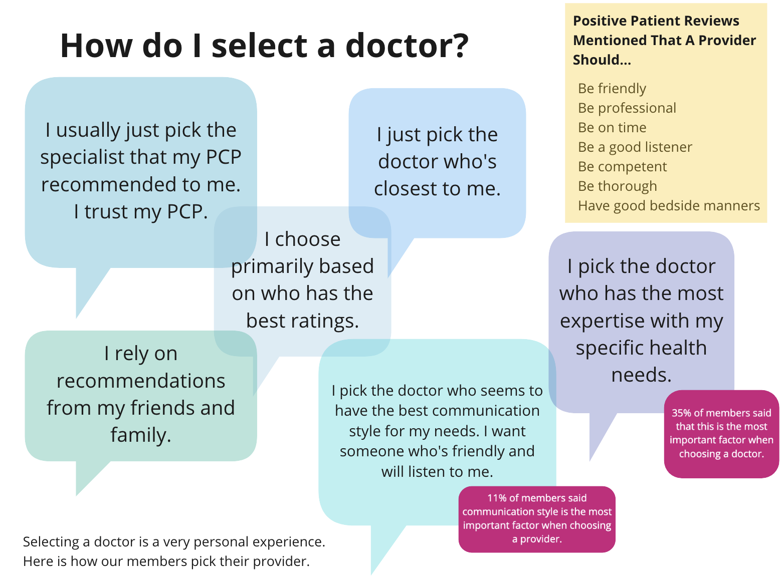
We jumped into research and user interviews. We wanted to learn exactly what our members wanted, and more importantly needed, when it came to finding a doctor. Ultimately, we engaged more than 1,000 members of our insurance company to help get this tool right. Here are some high level findings from one test we ran.

Here’s a snippet of a user journey map we put together.
Complete with emojis denoting a user’s emotion at each point in their journey with us.
There’s a lot more background research that went into this project, and lots of meetings around regulations and what we could and couldn’t do with the data we had access to. And here’s a spoiler: we don’t have access to a lot of confident data about providers in our network. So we did the best with what we had.
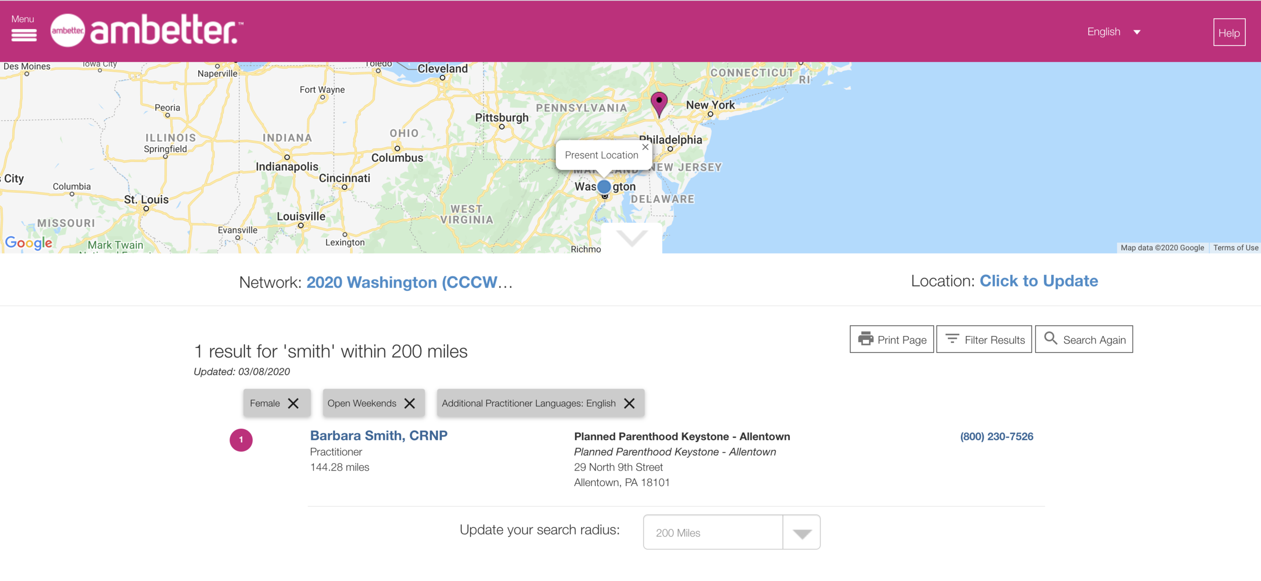
We achieved our goal: getting users data as fast as possible. Our data team enhanced the search bar capabilities to allow users to search for names, specialties, and facilities all in one search bar, right off the bat. No more going through 40 pages before seeing a doctor name.
We’ve monitored the entire site through Qualtrics feedback forms, user interviews, and Amplitude data and are continuing to enhance the site as we learn more.
Let’s jump into where the designs landed. Here’s mobile:


And here’s desktop:


