Health Care Home page experience redesign
Our team got a big assignment: redesign the entire member web experience. This was a huge ask, with lots of pages and experiences to redesign. The site hadn’t been updated since 2014 and what’s more, it wasn’t responsive at all. We knew that 60% of our users were accessing the site from their phones, so we knew their experience was more or less stinking on ice.
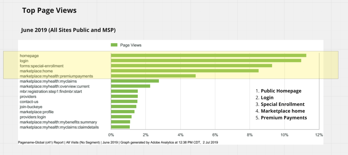
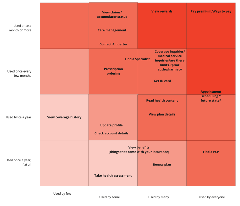
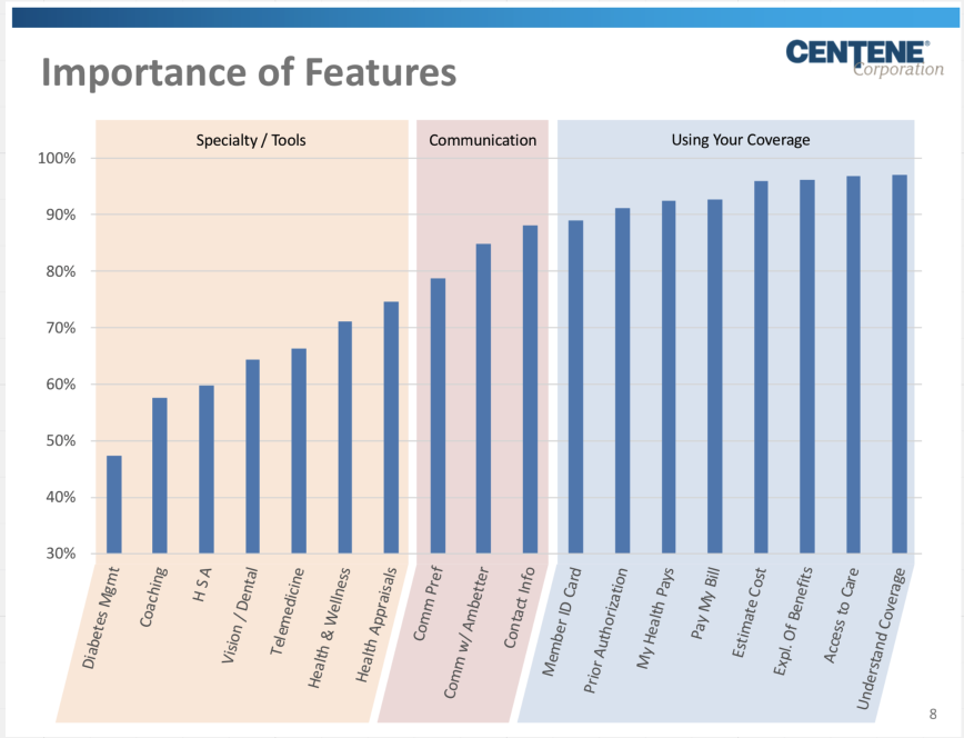
The journey to redesigning the entire experience started with the homepage. We tested several variations of possible home pages, and settled on one dubbed the “launch pad version”. Take a look at the research journey below.
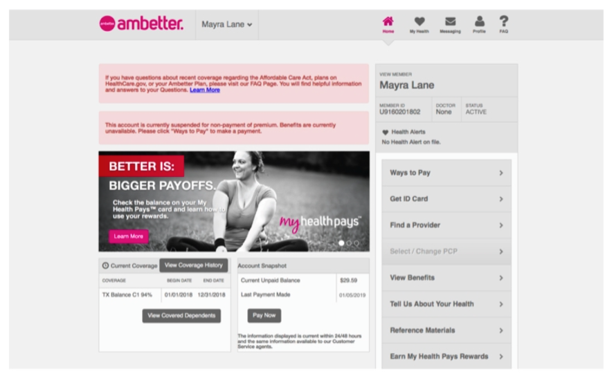
The first image is the home page that we inherited. This page was not responsive at all. Take note of all the links being on the far right side of the page. What a nightmare!
We went through several months of testing and iterations of designs, before we settled on the designs below. Take a look! And bask in the glow of the responsive design :heart-eyes:


Results
Early analytics of our tool benchmarked against the old one showed users found care 70% faster than they were the previous site, and doing so in less than 4 clicks on average. The previous site required users to click around 15 times to find the care they needed. SOURCE: Amplitude